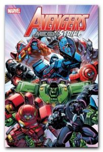
AVENGERS MECH STRIKE #1 MARVEL COMICS
Does anyone else smell a 1980’s Hasbro toy tie-in? Weaving back and forth between the movie Avengers and the comic Avengers, Jed MacKay’s story makes sense and is entertaining. And certainly, the art/color teaming of Carlos Magno and Guru-eFX is very effective. Its the concept that has me shaking my head. While I understand the purpose of the Avengers donning the Mech suits, I really question their use. Can any Mech suit really deliver the raw power of Thor or the Hulk? Can a Mech suit really be as agile and flexable as Spider-Man or the Black Panther? (And if Spider-Man is going to get a giant robot type suit, it dang well better be the one from the 1970 Japanese Supaidaman television series!) While definately done with a spirit of fun, I’m left with more questions than answers. Worth a look see. I give it a 7 out of 10 Grahams.
![]()

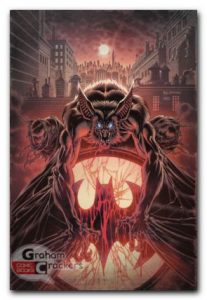
MAN-BAT #1 DC COMICS
Man-Bat was one of thos clever ideas from the 1970’s that had potential. And for at least 4 other stand alone titles, the tragic story of Kirk Langstrom has had no success. Essentially, the story of the good natured scientist being turned into an uncontrollable monster is a classic tale seen over and over in literature. And while Dave Wielgosz’s story is well done and focuses a lot on character interactions, there is nothing jumping out at me as new. Except for the fact that Langstrom is dying and we going to get a Suicide Squad crossover, its mining barren soil. Now don’t get me wrong, this is a readable story and if you are new to the character, this will definately work for you. But some of us were there in 1970, and in 1975, and in 1984, and in 1996, and again in 2006. We’ve seen his wife leave him countless times. We’ve seen Batman try to redeem him over and over. We’ve seen him lose control too many times to count. I give it a 6 out of 10 Grahams. ![]()

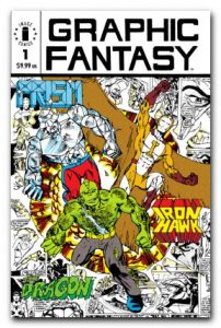
GRAPHIC FANTASY #1 IMAGE COMICS
Return with us now to those thrilling days of yesteryear. When raw talent was brought in to our eyes in the form of black and white independant comics. And who better to be an example of these glory days than Erik Larsen! Before being one of the Image 7, Graphic Fantasy was showcasing his unpolished work. Much like the Prism character he letters and inks here, these pages are diamonds in the rough. Including a certain green skinned (we didn’t know that yet – black and white comic … remember) well loved character minus his head fin. Plus its apparent that these boys knew what the public liked including a two page character spread with traditional 1970’s numbered outline index. These were definately a different time but just as exciting! I give it an 8 out of 10 Grahams.
![]()


